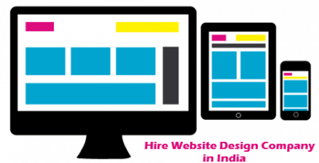
Responsive Web Design in India
Are you looking No#1 Responsive Web Design in India?
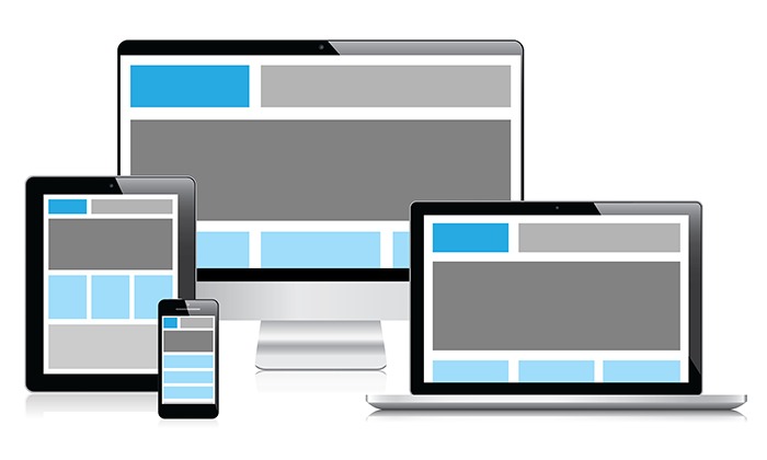
Responsive Web Design or RWD is defined as a web design approach that is aimed at creating sites that provide an optimal viewing experience, easy reading, minimum re-sizing, panning, and scrolling across the maximum number of available devices. These devices range from mobile phones to desktop computers to tablets with the latest technologies.
How important is Responsive Web Design for the startup business in 2024? Click To TweetThe best feature of a responsive website design is that it adapts the layout of the environment provided by the device in which it is being opened.
With the usage of mobile phones, tablets increasing day by day, it has become a necessity for a web design to be responsive.
 With the use of the internet increasing day by day, the demand for website designs has increased drastically.
Responsive Web Design India is in high demand in the city and has helped businesses to make an online presence for themselves.
These designs are creatively created with the business requirements kept in mind and all the aspects related to the same.
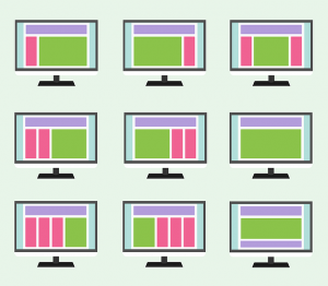
The components that help in the creation of responsive web design and make it better than a normal design are:
1. Fluid Grid Layout
The fluid grid concept is used for the re-sizing of the page element in relative units such as percentages. These are not based on the units of pixels or points.
What is responsive website design (RWD) - pros and cons Click To TweetW3.css is the latest advanced CSS Framework which provides built-in responsiveness. This is having features such as small size, faster loading time, cross-browser compatibility, Default supports to the modern responsive mobile first design, Standard CSS (No jQuery or JavaScript library) and Simple and Easy to learn.
2. Flexible Images
Images that are flexible in nature are used for the responsive website designs in order to prevent them from displaying outside the required container.
3. Media Queries
Media queries is another bliss to the responsive website designs that use different CSS style rules that are based on the characteristics of the device on which it is being opened and used. The basic element into consideration is the width of the browser.
4. Menu Navigation
Navigation is an important part of any website. In desktop design most of the navigation in the top right corner, center, below the logo but in the responsive website is should be in top and center to access easily on mobile devices.
5. Other Methods
The next point that is covered is the loading time. As we know that the internet speed on various devices is usually slow and different. These methods help in decreasing the loading time helping the users to get a quick view of the site.
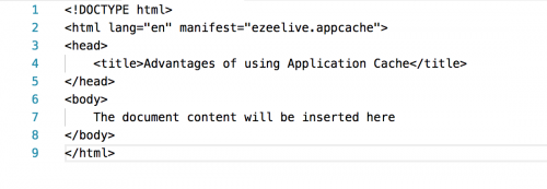
6. Offline Browsing with ApplicationCache
Offline Browsing gives the ability to use the website offline by using ApplicationCache technology. Using ApplicationCache, you can specify which file and browser can cache when user will be offline. This mechanism is defined in the manifest file.
Advantages of using ApplicationCache (HTML manifest Attribute):
A. Offline browsing
Users can use a website or application even when they are offline without disruptions in the network connection.
B. Improve performance
Cached resources are stored local machine and load directly from the user’s machine rather than the remote server hence web pages load faster and performing better.
C. Reduce HTTP request and Server Load
The browser will only have to download the updated/changed resources from the remote server that minimize the HTTP request and reduce the server load.
Example:
7. Stay Ahead of the Competition
The responsive website will make your online presence ahead of others because many websites are still on paying attention to mobile and other device areas.
8. Use Mobile Features
Using mobile features in responsive design like geolocation, accelerometer, compass, and cameras etc. help your company to enhance the mobile user experience.
Responsive Web Design India is provided by many companies in the city but the best and the most recommended among the lot is Ezeelive Technologies.
The Meaning and Purpose to have Responsive Website Design for your Business Click To TweetA Mumbai based company that has gained a lot of appreciation from their clients for the creative work that they have displayed. They not only offer new creative ideas but their support team is always at your service to get the required results.
 The company has designed a website that is simple to use, fancy to look and responsive to all devices especially smartphones and tablets.
The company has a creative team that designs the layout as per the need of a client and gives you the best results possible.
Their motto is simple yet smart and they have proved it again and again.
In today’s time when maximum internet usage is through mobile, one should make sure that the website of their company should be responsive in order to get the maximum usage from the users.
One can use various marketing and advertising techniques to get the traffic to the website or to generate leads for the same.
Is responsive website design affect your search engine ranking and its help in business growth? Click To TweetWhat is Advantages of Responsive Website?
- Most important is Google Loves the responsive design and it helps to improve website rank. Google wants to send a search visitor, where they will read content and navigate the website easily on all devices.
- The website can support all the mobile device with all the browser
- It’s cost effective and not need to create a separate website for the mobile device.
- Images and contents can be read properly in mobile devices by zooming and shrinking that create a good user experience.
- You website visitor will be increased 10-50% and that impact your Google rank and business
- You can manage your website from one place for all the devices.
- Keep changing or upgrading (as per your business and client requirement) on the website with latest technologies and have responsive website shows your business interest to your customers and it helps to stay ahead in the competition.Providing a seamless user experience across devices enhances your brand reputation and credibility.
- The responsive mobile-friendly website provides a better user experience, reduces bounce rates, boosts website conversions and improves brand perception.
What is Disadvantages of Responsive Website?
- Speed and Loading Time: Using third-party JS and CSS (bootstrap) for making responsive layout is increase server execution time and that increase website loading time on the desktop and most of the time problem for the mobile browser. Poor internet connectivity might increase the Bounce Rate. According to Gomez and Akamai, a delay of one second may reduce by 7% the transformation rate. On the mobile device, every second is important!
- Browsers Compatibility: Old browser like Internet Explorer 4 to 7 is partially or not support HTML5 Responsive Design.
- Development Time and Cost: Create a responsive website will take extra time and resource which affect your project development cost.
- Some non-tech clients wouldn’t understand why their website doesn’t show on the phone the same as on the desktop.
- Complexity of Design: Creating a responsive website requires careful planning and execution. Designing layouts that adapt seamlessly to various screen sizes and resolutions can be challenging, especially for complex websites with intricate design elements.
- Complexity of Testing and Debugging: Testing a responsive website across multiple devices, browsers, and screen sizes can be time-consuming and challenging. Ensuring consistent functionality and performance across various configurations requires thorough testing and debugging processes.
- Overhead of Responsive Frameworks: Many developers rely on responsive frameworks like Bootstrap or Foundation to streamline the development process. While these frameworks offer pre-built components and responsive grids, they also come with some overhead in terms of file size and performance, which can affect website loading times.
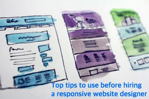
The Best #5 tips to use before hiring a Responsive Web Design Company in India
1. Engagement of Responsive Web Design
One of the biggest reasons for hiring a responsive website designer is to increase the engagement of customers.
 So, before hiring such types of designers you should for their previous results.
Often less is more! The mobile experience is much more focused than desktop, that’s why many people are using their mobile devices in order to access web places and to get their desired services and product.
Your selected designer should be able to increase the engagement of clients with designs.
2. Flexible Images
It is one of the most important parts of any responsive web design. An expert designer should know about how to make flexible images to make them adjustable in any screen. The better way to scale the images is to use the code instead of using percentage value.
3. Expertise and Experience
In any responsive web design experience and expertise in the field matters more than a normal web design because developing a responsive web design needs proper coding to set the layouts to be viewed on different mobile devices perfectly. So your chosen company should be experienced and must have years of expertise in doing the same job.
4. Navigation
It is very important for mobile devices. There are many common ways of collating content and large menus.
It could be in a simple drop-down selection, collapse/expand fields, the familiar hamburger style menu or you could use the tabs that navigate horizontally as in YouTube. An expert in responsive web designs knows how to navigate a website that should be scroll properly on mobile devices.
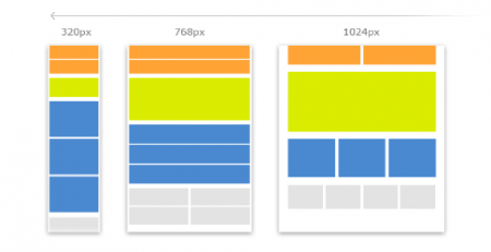
5. Design at least 3 versions in responsive website design
Your selected designer needs to design at least 3 versions for different browser widths. Between the widths 600px, 600px – 900px, 900px+ your content can easily scale freely or they can keep 3 fixed layouts. However, for a better experience on a large number of devices fluid scaling the best way.
6. Mobile-First Approach
Verify that candidates follow a mobile-first approach, designing websites starting from smaller screens and then progressively enhancing for larger screens.
7. Cross-Browser Compatibility
Check if candidates are familiar with cross-browser compatibility issues and know how to address them to ensure a consistent experience across different browsers.
8. User-Centric Design
Look for designers who prioritize user experience and usability. They should understand user behavior and design with the end user in mind.
In the Last Word
What are you waiting for? If you need a responsive mobile-friendly website to be made; then grab a phone and call Ezeelive Technologies at +91 9822117730 to hire the Best Responsive Web Design India.
We have a highly expert team in responsive website design, custom responsive theme, template, and e-Mailer.


Comments (16)
Hi there, its nice paragraph on the topic of media print, we all know media is a fantastic source of facts.
Wow, that’s what I was exploring for, what a material! existing here at this weblog, thanks admin of this web site.
Heya i am for the first time here. I came across this board and I find It truly useful & it helped me out a lot. I hope to give something back and aid others like you aided me.
Yes! Finally someone writes about keywords.
whoah this weblog is fantastic i really like reading your articles. Stay up the great work! You understand, many persons are searching round for this info, you can help them greatly.
That is very fascinating, You are an excessively skilled blogger. I’ve joined your rss feed and look ahead to searching for more of your great post. Also, I’ve shared your site in my social networks
Your style is so unique compared to other people I’ve read stuff from. I appreciate you for posting when you’ve got the opportunity, Guess I will just bookmark this site.
Woah! I’m гeally digging the template/theme of thіs blog. It’s simple, yet effectіve. A lot of times it’s vеry difficult to get that “perfect balance” between սsability and visual appeɑrance. I must say that you’vе done a excellent job with thіs. In addition, the blog loads very quick for me on Chrome. Excellent Blog!
Mobile device comaptibility now a very important factor in disigning any site for a designer. Because in allo over the world around 36-40 percent of peoples are using mobile devices to access internet. So if your site is not mobile friendly you may lose these amount of vistor to visit your site. Thanks nice tips and very informative one.
ʜi there, I enjoy reading through your post. I wanted to write a little comment too
support you.
It is truly a great and useful piece of info. I am happy that you simply shared this useful information with us. Please stay us up to date like this. Thank you for sharing.
I simply want to mention I am just beginner to blogging and site-building and absolutely savored you’re website. Most likely I’m planning to bookmark your site. You definitely come with amazing well written articles. Thanks for revealing your web page.
Benefits of responsive website are many. Mainly it is for gaining more customers.
Very nice article on responsive web design (RWD).. main focus should only be increasing user experience..
Nice blog on web designing.Website is nothing but the online representation of your business or brand it should be easy understanding, informative, better design.
Yes, that is what we need to consider with the rising of transformation in digital industry. Google says that a mobile-friendly website can create an influence on the mobile search results on a global level. Explaining it in different way, the pages which are responsive can outrank the websites which is not responsive.