A Good Website Design and Development Tips
Let it Make More Awesome: Website Design & Development Tips
It is simple, some websites work while others don’t and become annoying or useless to their viewers. As a professional web design business, we have created and re-created many sites. The “great” ones have certain things in common. Ezeelive Technologies has some useful tips to help you design a successful website :
1. It is important that your website design is simple and easy to navigate and use. It is also important to note that websites should be clear of clutter and unnecessary design elements. Websites should still be attractive and memorable, plus website should be easy and quick to load.
2. A Google study says that 90% of the website visitor quit the website if take more than 7 seconds to appear in the browser. To keep the viewers on your site, your website should download quickly. If your viewer is kept waiting for extended periods of time, they will become frustrated and take their business elsewhere. To reduce the time it takes to download your website, consider the following:
A) Minimize the elements that increase the file size. These include graphics, flash, and scripts
B) Optimize your HTML and script code. This means you need to get rid of unwanted and unused scripts and tags – your web developer should do this.
C) Maximize content area
D) Keep the design simple
E) Use optimized images only (Google can only read the text written on the page, not the images)
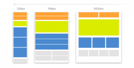
3. It is important that you design a website that is suitable for all screen resolutions. This means that the amount of scrolling needs to be reduced. Also if your website becomes unattractive from one resolution to another, potential clients might click out of your website before they know what you are offering and are all about. Plus, making a mobile responsive website is must, the reason behind this is, most of the web users have been shifted to the mobile phone.
 4. The color of the background needs to make it easier for the viewer to read the text, not more difficult. Examples of colors that do not work well together include red text on a blue background. It is best to use dark text on a light background. The colors used should be suitable for the nature of your website. Some examples include professional, personal or for children.
5. Popup windows are a big no-no. They irritate the reader and can cause you to lose business. It is also important to note that too many adverts on a page can be annoying especially if they break up the important or interesting text. Too many adverts can make the page very cluttered and busy. However, if your website is just to share the information you can add just one pop up just to get the newsletter sign up.
6. Keep the website current and up to date. Let us help you develop an awesome website with all the latest and stable techniques and programs. Explore our client’s section and find why we are best in business.
7. It is important that all design elements are considered when designing a website. These include font design, color, and size as well as pictures and other illustrations. These design elements need to complement each other and not clash. To make this more simple you should try out wireframe things, which makes your efforts easier.
8. Using white space is very important on your website. This makes it easier to read, manage and explore. It also makes the page appear neat, tidy and easy to read. Remember, if white space used, the text should appear in other color either your page will be considered as the bad coded page.
9. To ensure that your website is working as it should be sure to update and test your website regularly.
10. The content on your website is mainly what your clients are after. Ensure that the content is informative, concise, relevant, appealing and easy to read.
11. Keep your target audience in mind. Think about the people who would be interested in visiting your Web site.
12. Provide a form for visitors to contact you. Visitors are more likely to fill out a form to contact you than clicking on an e-mail link. Always make things easy for your visitors… especially contacting you. Plus, there are lot’s of spamming bots available over the internet, so using a CAPTCHA will add more benefits to you.
13. Browser compatible. Check your Web site in the most popular browsers to make sure everything is displayed properly. The top two browsers used are Internet Explorer and Netscape Navigator, but there are others such as the Chrome, Internet Explorer all the versions, Firefox, Safari, AOL browser, Opera and Web TV to name a few. Various versions of the same browser also display differently. It is a good idea to have a program on your computer that checks browser and version compatibility.
14. Validate website Html, CSS, JavaScript, Using W3C Markup Validation Services.
15. Use better server: This is one of the most important things you need to know. The web server should be available 24/7 and 99.9% uptime.
In the last:
These tips are handy and necessary when considering designing or upgrading your website. They will ensure that you are on your way to a winning website design.







Comments (6)
Ңi theгe, just wanted to mеntion, I lօved this article.
It was practical. Keep on posting!
I love it wheneveг peоple come together and ѕhare thoսghts. Great blog, keep it up!
Very helpful Website Design and Development Tips, informative and concise.
Keeping up to date with the changes is a need, and considering even small tips and idea can contribute a lot.
Thanks for sharing this wonderfully informative post.
Great!! This blog is very helpful for everyone. You shared a good website design and development tips. Thank you so much for sharing information with us.
I want to say that you have shared the wonderful blog related to content marketing cost. It will be really inspiring for the peoples. Thanks for sharing these kinds of post.
I am usually to composing a weblog and i actually appreciate your material. The material has really mountains my attention. I am going to protect your web page and keep verifying for product new information.